The Psychology of Restaurant Menu Design: Colors, Fonts, and Layouts

 A restaurant menu does much more than list food and prices. It acts as a silent salesperson, influencing what customers notice, what they order, and how much they spend. While food quality remains the most
 Restaurant owners and marketers often apply psychological principles when creating menus. Elements such as colors, fonts, and layouts can subtly guide customer behavior without them even realizing it. Understanding these design choices can help restaurants create a better dining experience while improving sales.
The Power of Color
Color is one of the first things customers notice when they open a menu. Colors affect emotions, appetite, and purchasing behavior.
Red is commonly associated with excitement, energy, and hunger. Many fast-food brands use red because it encourages quick decisions and can stimulate appetite. Many restaurants incorporate red into their menus and branding to create a vibrant atmosphere.
Yellow is another popular choice because it conveys warmth, optimism, and friendliness. It can attract attention and create a welcoming feeling. When combined with red, it often creates a sense of urgency, which is why many fast-food chains use both colors together.
Green is strongly connected to freshness, health, and nature. Restaurants that focus on organic ingredients, vegetarian dishes, or sustainable dining frequently use green to reinforce their brand message. Customers often associate green with healthier food options.
Blue is less common in food marketing because it naturally suppresses appetite. Since very few naturally blue foods exist, the color can reduce feelings of hunger. However, upscale seafood restaurants or modern dining establishments may use blue to create a calm and sophisticated atmosphere.
Black is often associated with luxury, elegance, and premium quality. Fine dining restaurants often use black menus with minimalist designs to convey exclusivity and sophistication.
The key is not simply choosing attractive colors but selecting colors that support the restaurant’s identity and desired customer experience.
How Fonts Shape Perception
Typography is another powerful psychological tool in menu design. The font style can affect how customers perceive the restaurant and its food. Elegant script fonts often communicate sophistication and exclusivity. Fine dining establishments may use these fonts sparingly for headings or restaurant names to create a sense of luxury. However, overuse of decorative typography can make menus difficult to read.
Serif fonts can create a sense of quality, trust, and professionalism. Many classic restaurants use serif fonts to create a timeless feel. Sans-serif fonts, with clean, modern lines, are commonly used in casual dining and contemporary restaurants. They provide excellent readability and create a clean, approachable appearance.
Font size also matters. Larger fonts naturally draw attention to specific dishes, increasing the likelihood they will be ordered. Restaurants often highlight high-profit items by giving them slightly larger text or bolding them.
Descriptive language combined with thoughtful typography can further increase sales. Studies have shown that menu items with detailed descriptions often appear more appealing and can command higher prices. When paired with attractive typography, these descriptions can significantly influence customer choices.
Strategic Menu Layouts
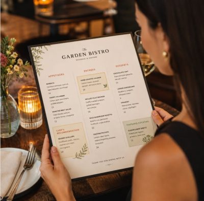
The way menu items are organized can significantly impact customer behavior. Menu designers carefully consider how people read and scan information. One popular concept is the “golden triangle.” Research suggests that customers often look first at the center of a menu, then move to the top-right corner, and finally to the top-left corner. Restaurants frequently place high-profit or signature dishes in these high-visibility areas.
Another common strategy involves visual framing. Boxes, borders, or subtle design elements can draw attention to selected menu items. Customers naturally notice these highlighted sections and are more likely to consider those dishes.
Menu categories also influence decision-making. Clear organization helps customers navigate options quickly and reduces decision fatigue. Appetizers, main courses, desserts, and beverages should be grouped logically and presented in a way that feels intuitive.
White space is equally important. A crowded menu filled with too many choices can overwhelm customers. Research has shown that reducing the number of options often makes decision-making easier and improves customer satisfaction. Clean layouts create a more professional appearance while highlighting featured items.
The Psychology of Pricing
Menu design extends beyond colors, fonts, and placement. Pricing presentation can also affect purchasing behavior. Many restaurants remove currency symbols from menu prices. Seeing a dollar sign or other currency symbol reminds customers of spending money, which can make them more price-conscious. Listing a price as “12” instead of “$12” can make the purchase feel less transactional.
Restaurants may also avoid aligning prices in a vertical column. When prices line up neatly, customers can easily compare costs and may focus on choosing the cheapest option. Integrating prices into menu descriptions encourages customers to focus more on the food itself.
Another common strategy is anchoring. By placing a very expensive item near other dishes, restaurants make those surrounding options seem more reasonably priced. Even if the premium item sells rarely, it can influence customers to spend more overall.
Balancing Psychology and Customer Experience
While psychological techniques can increase sales, successful menu design should never feel manipulative. A menu that is clear, attractive, and brand-consistent can leave a positive impression.
The most effective menus balance business goals with customer convenience. Colors should match the restaurant’s atmosphere, fonts should be readable, and layouts should simplify decision-making rather than create confusion.
Ultimately, menu design is both an art and a science. Every color, font, and layout choice sends subtle signals that shape customer perceptions. By understanding the psychology behind these elements, restaurants can create menus that not only look appealing but also enhance the dining experience and encourage smarter purchasing decisions.